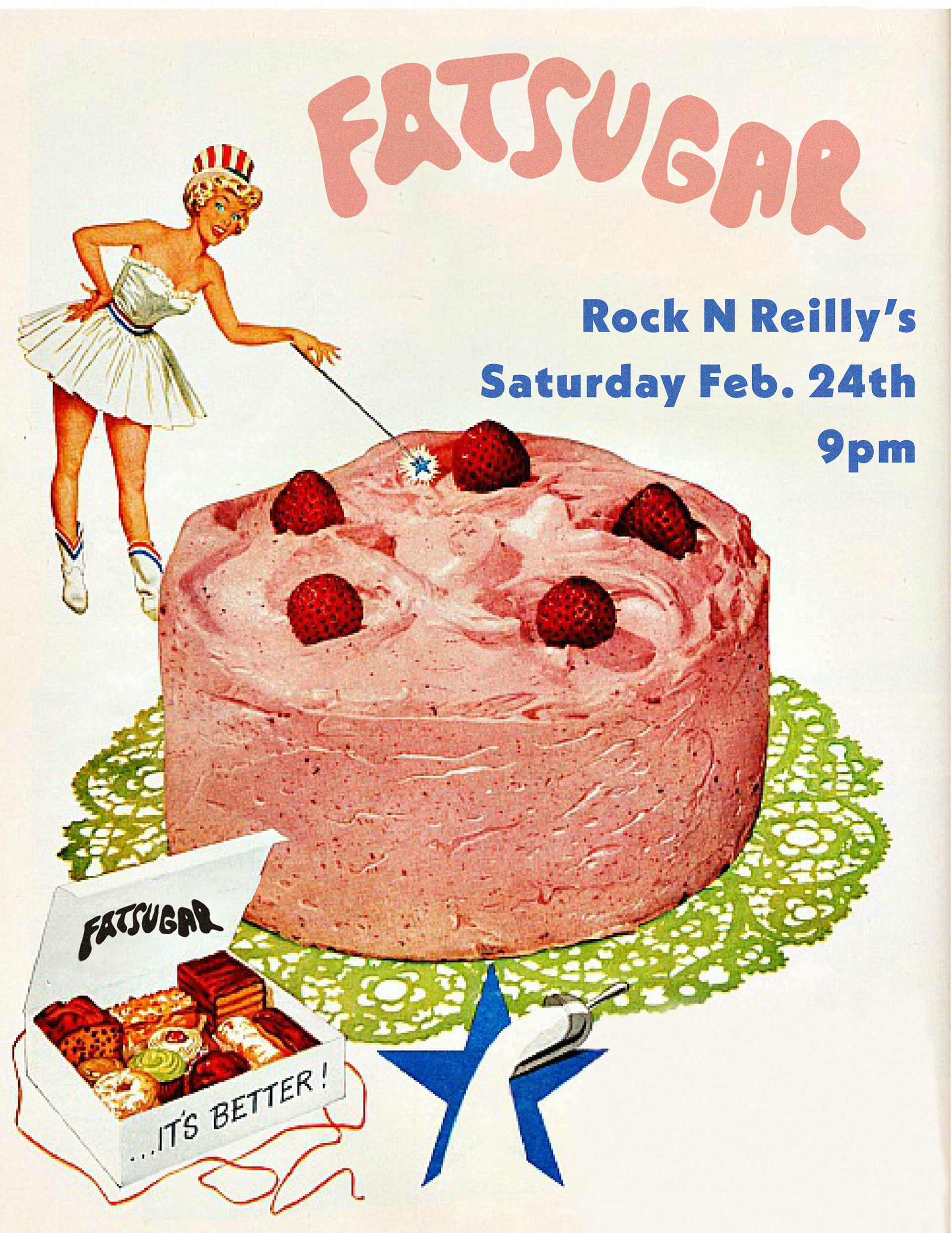
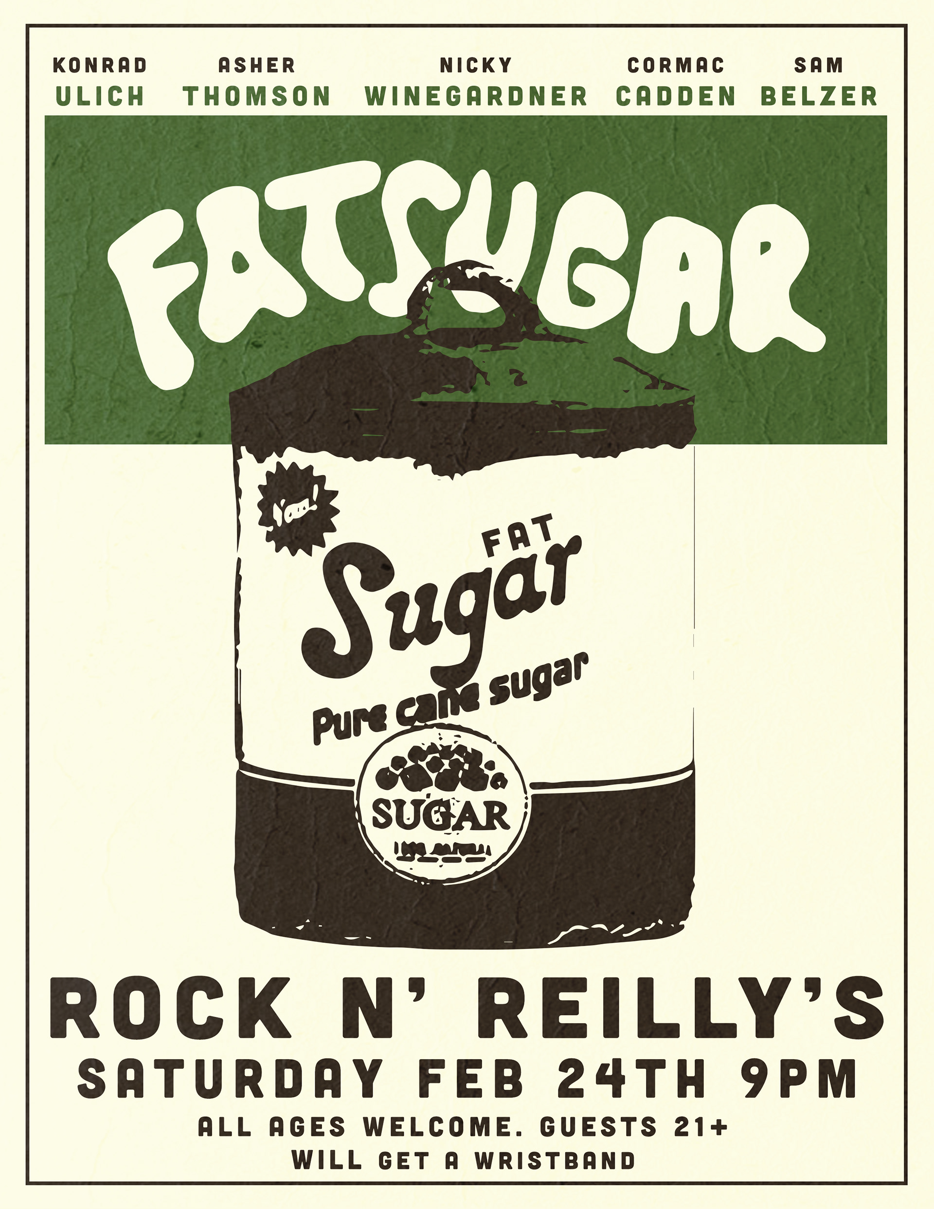
Before Common People, there was Fat Sugar, a college band with a bigger, bolder personality to match.
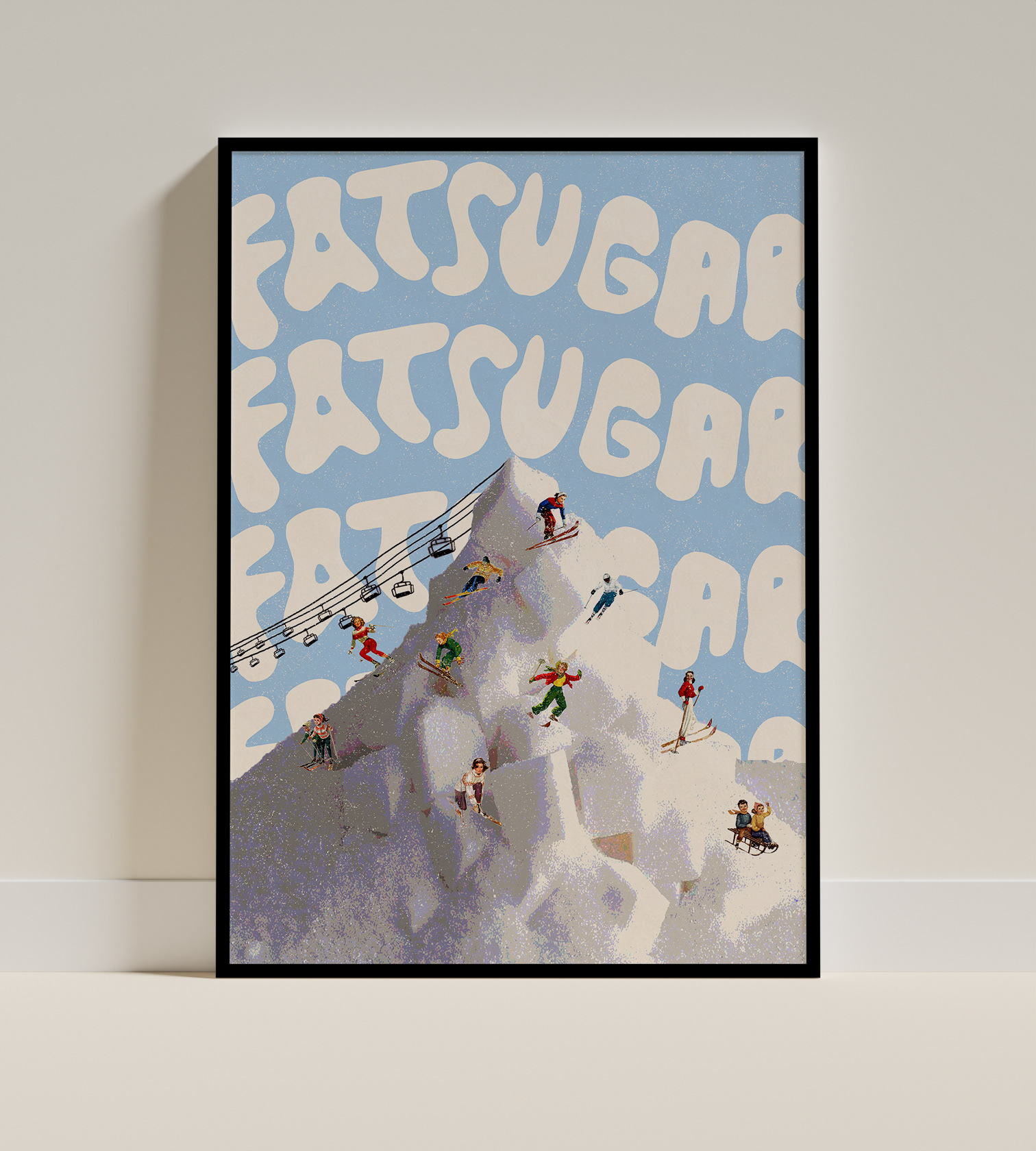
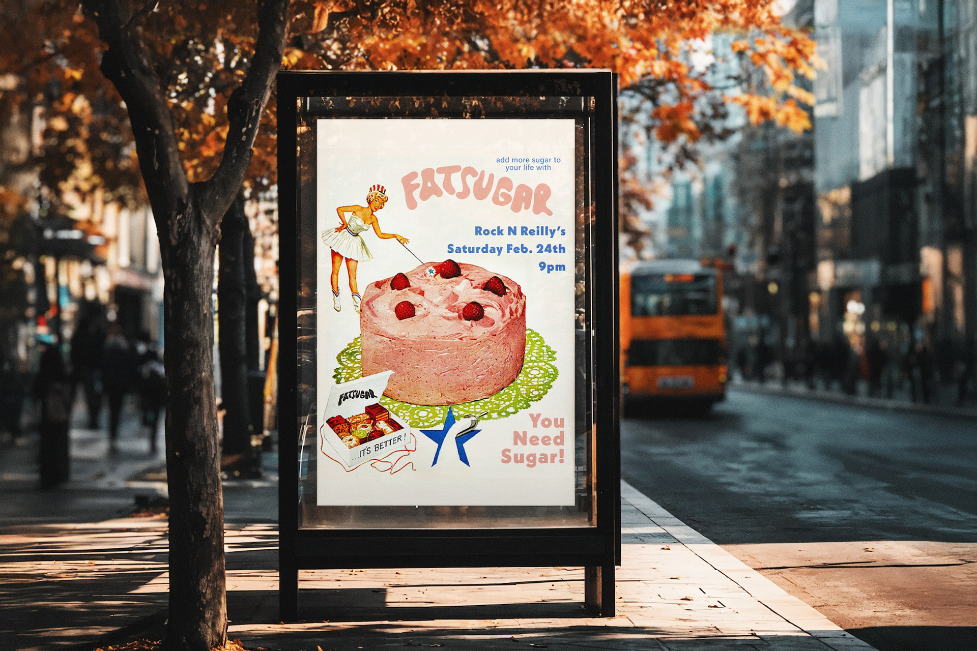
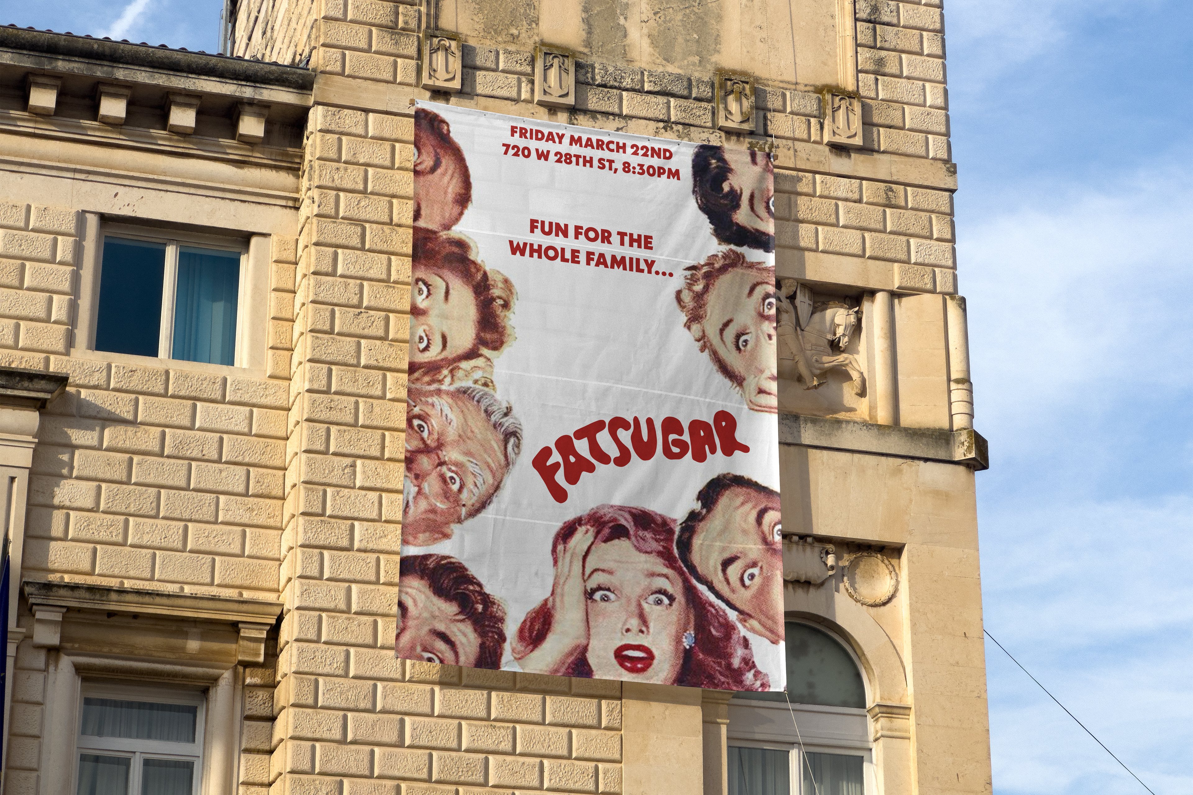
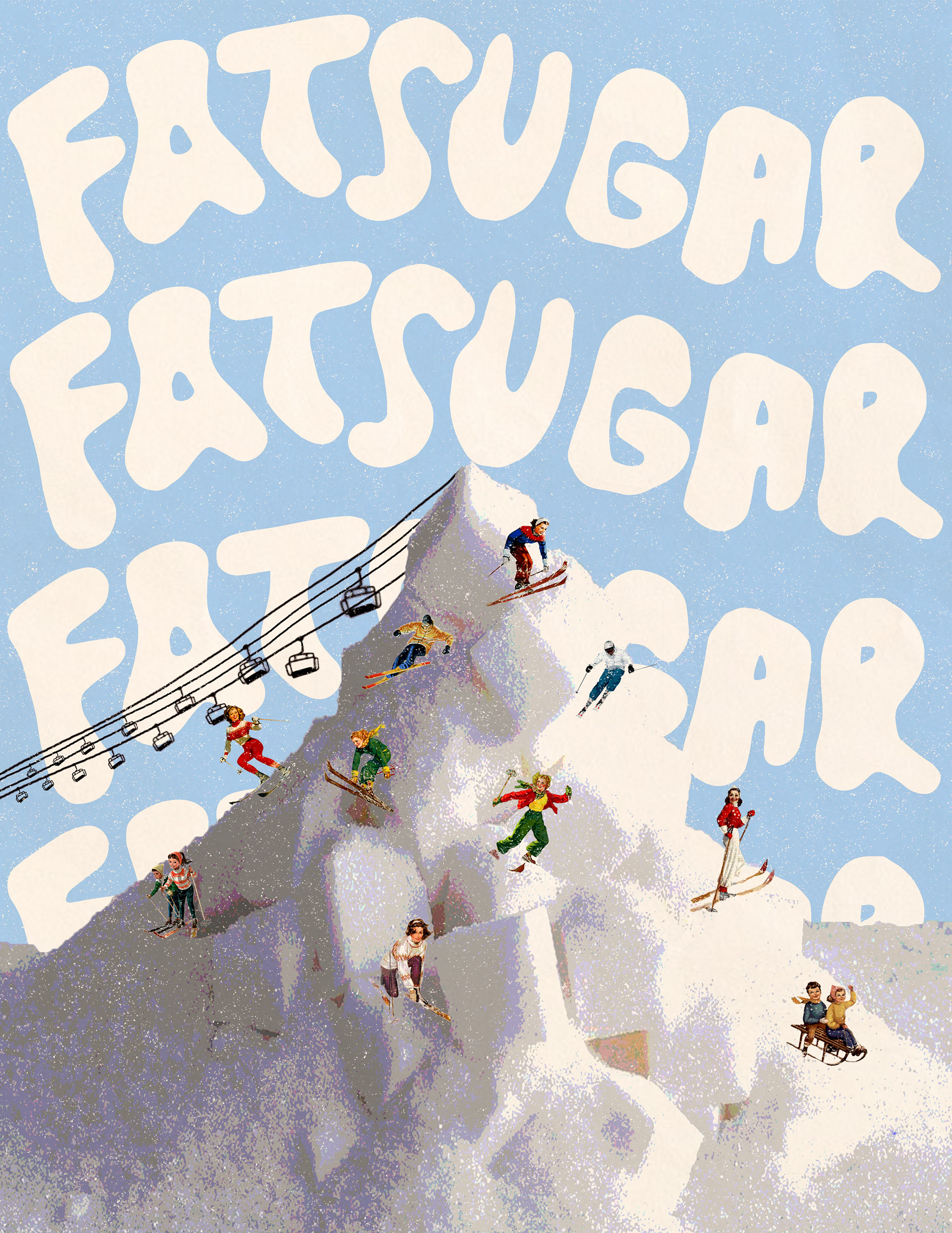
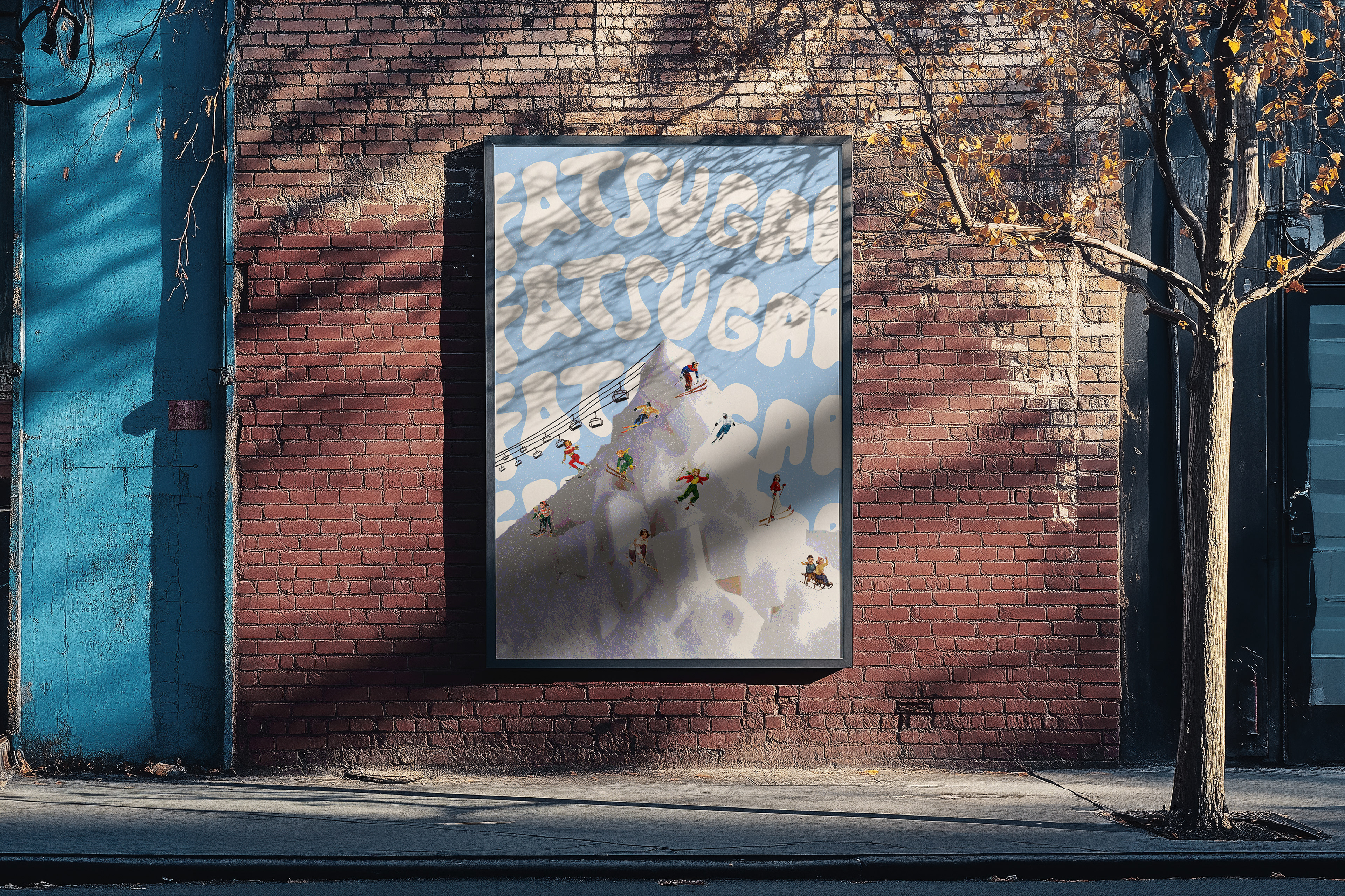
For Fat Sugar, I leaned into a nostalgic aesthetic inspired by vintage candy/dessert advertisements. Playful typography, saturated color, and a visual sugar rush. This was designed to feel as addictive as the bands music. I wanted people to feel like they were indulging in the sound. As the band evolved into Common People, so did the visual identity, and I evolved with it.
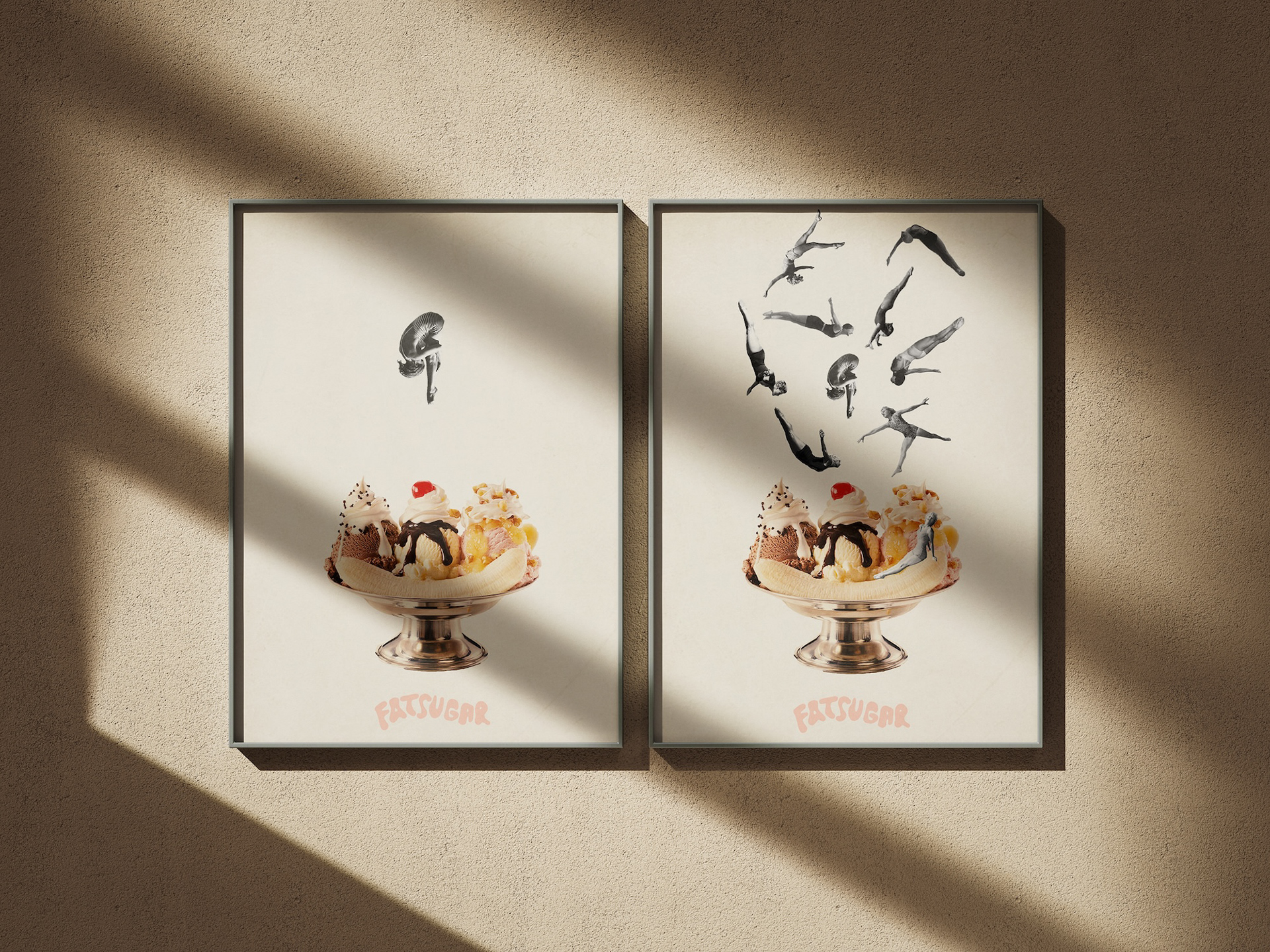
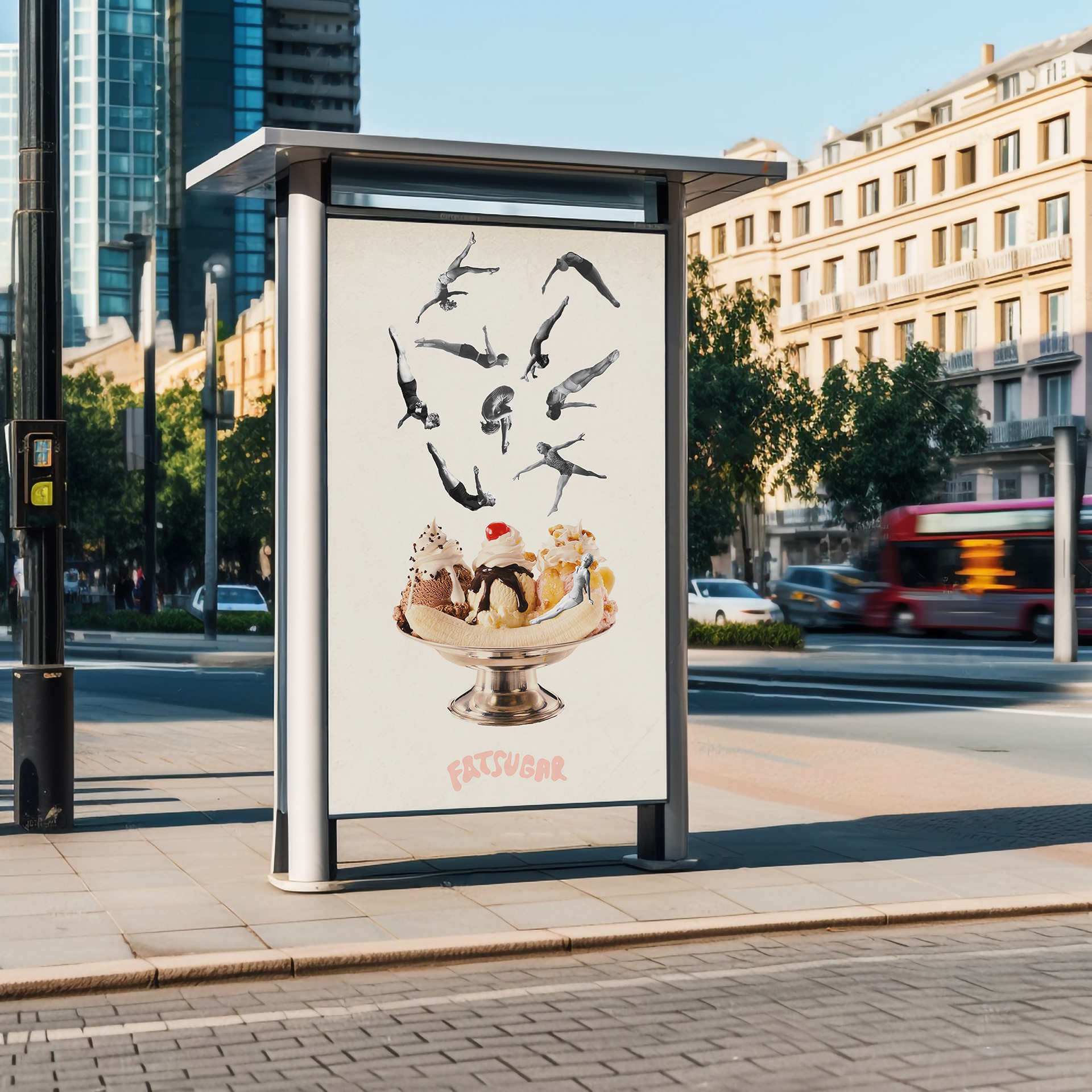
Getting to design across both chapters of the same band taught me something valuable: a great brand isn’t static. It grows, shifts, and sheds its skin, and the best design grows with it.