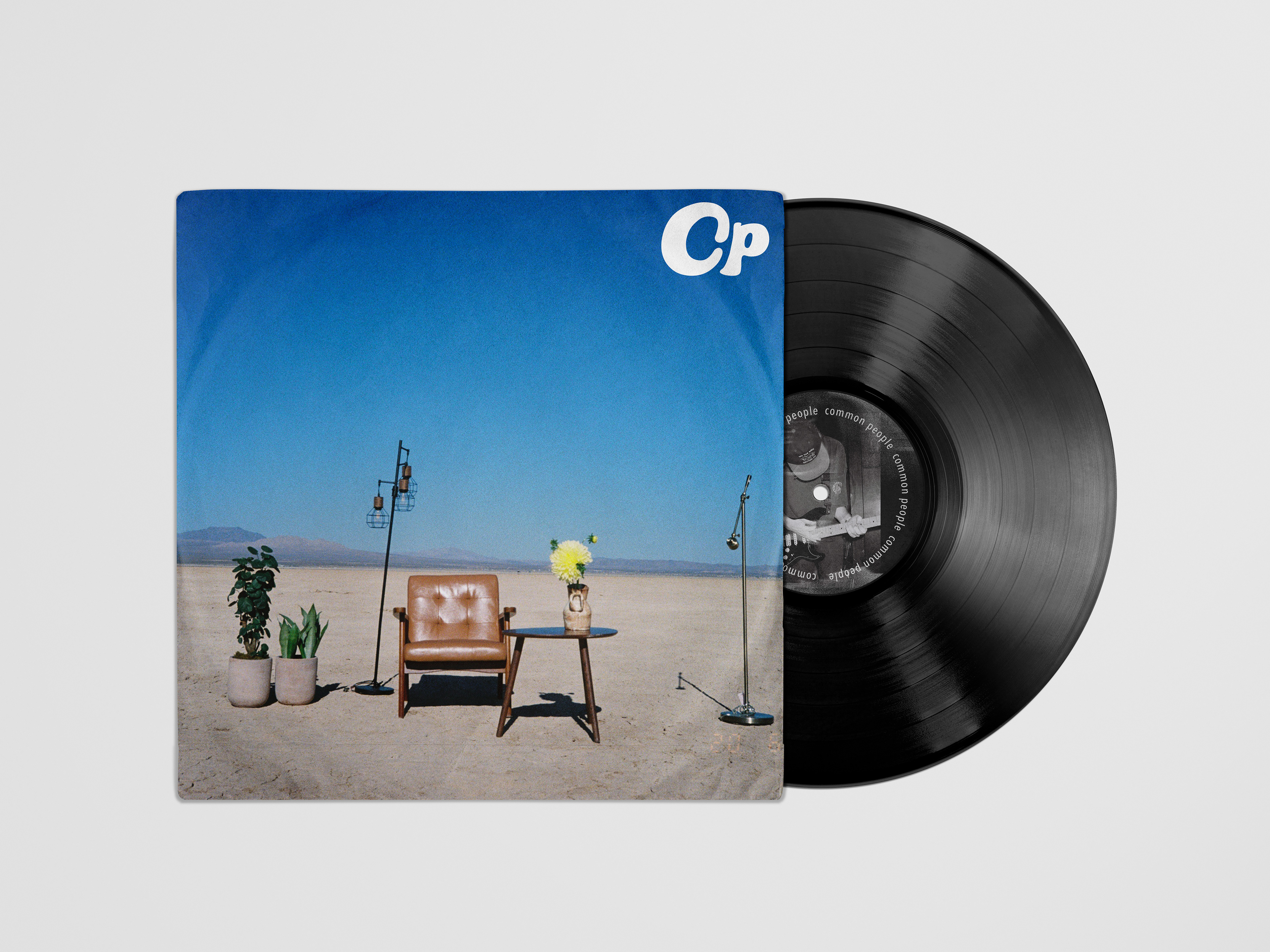
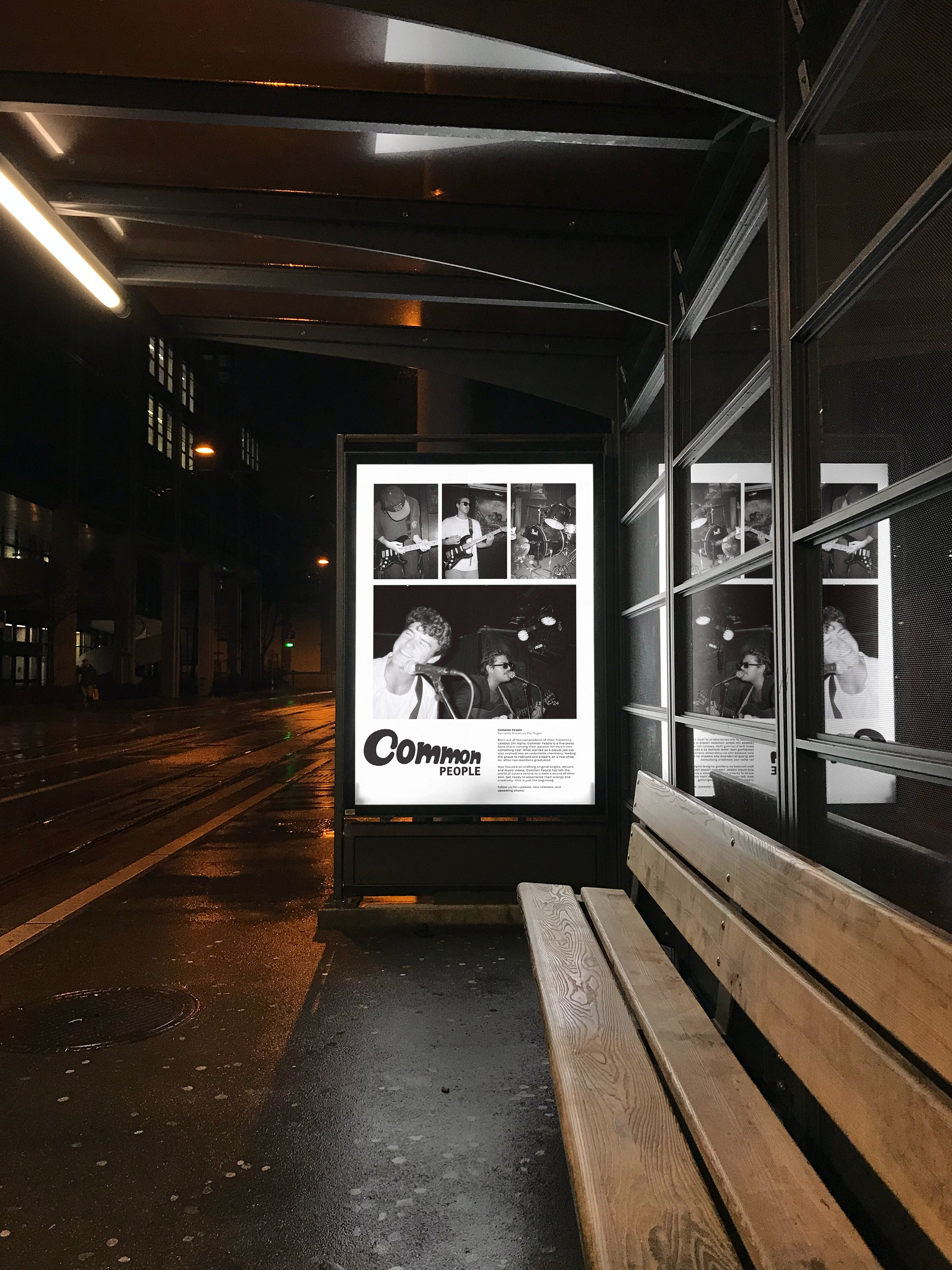
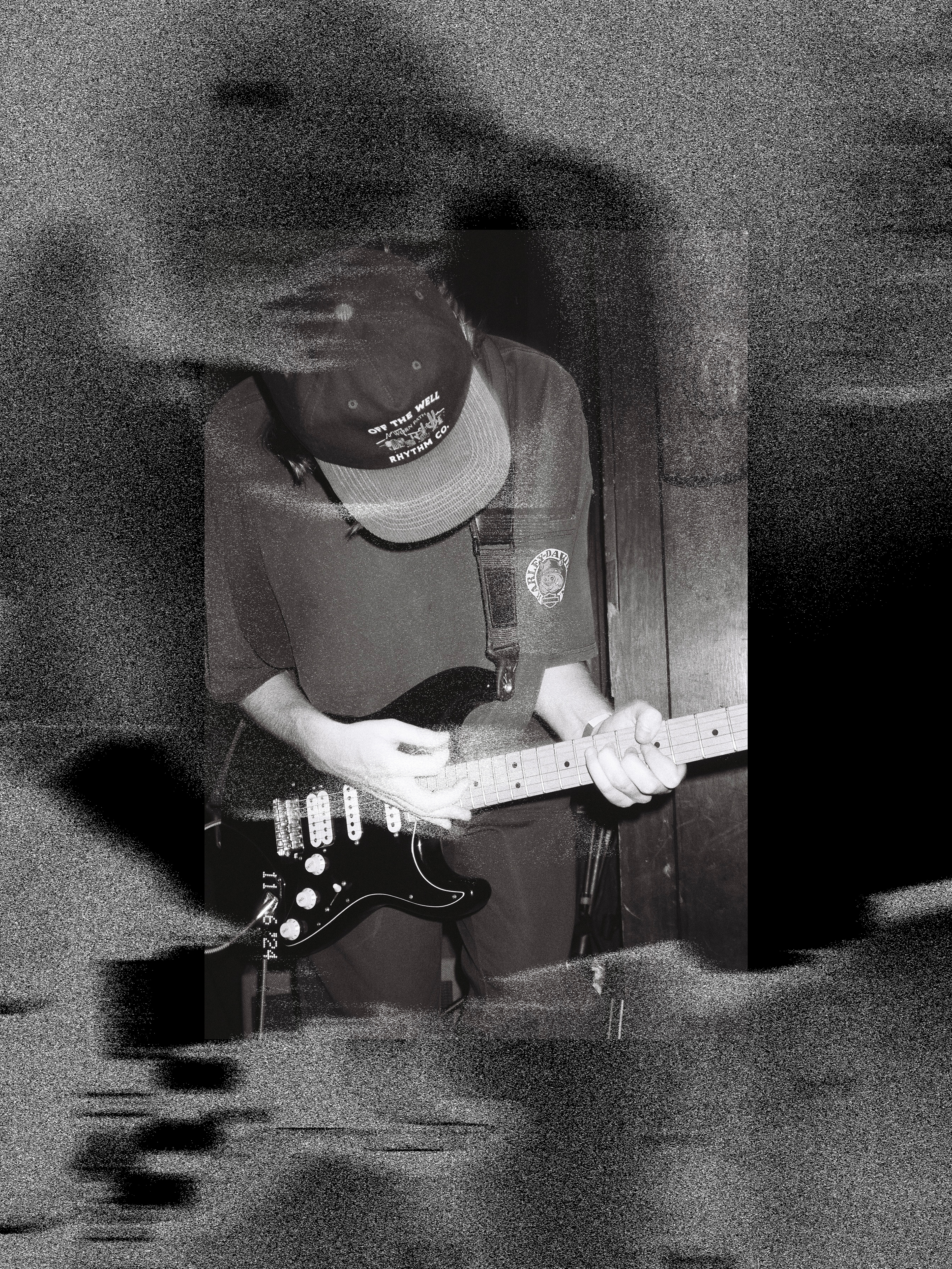
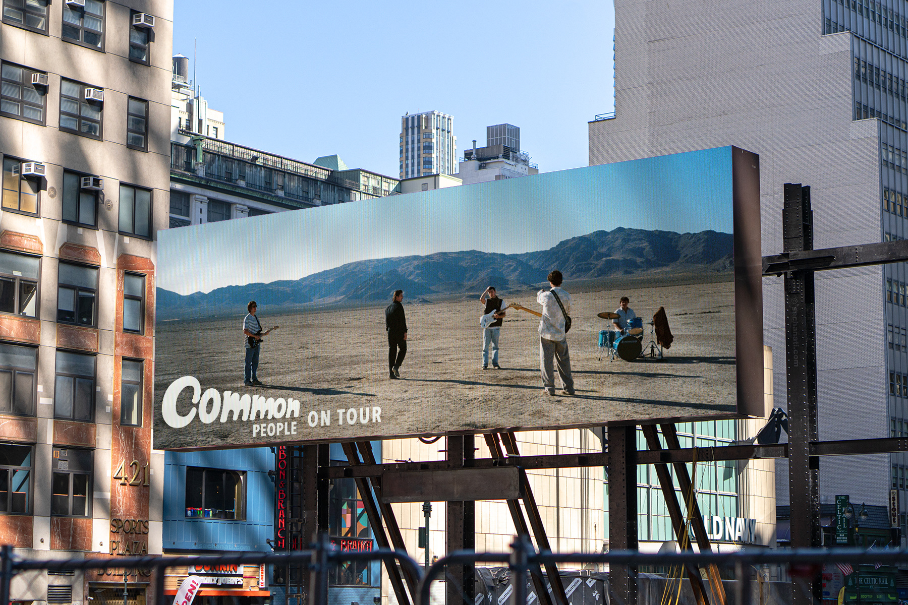
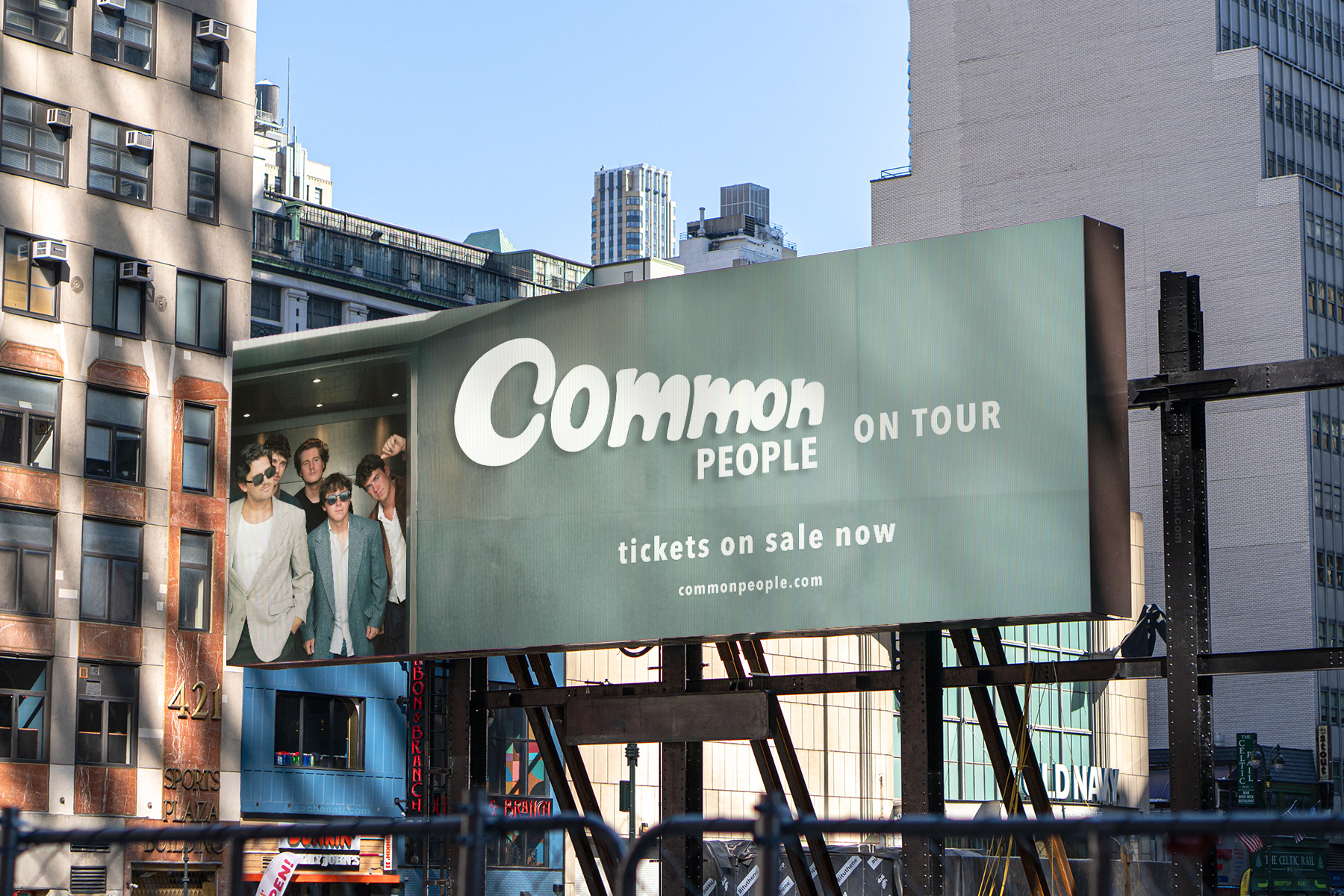
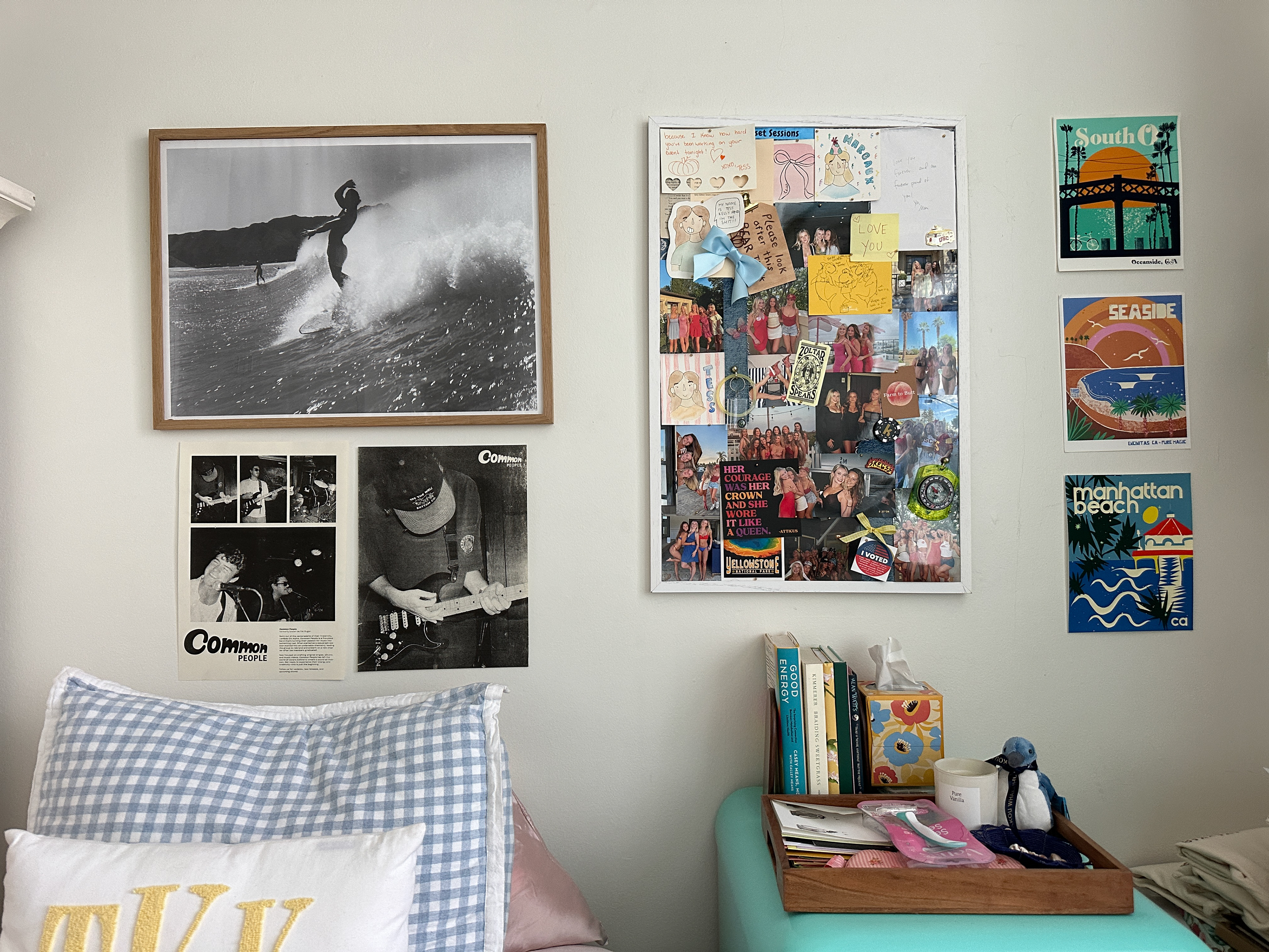
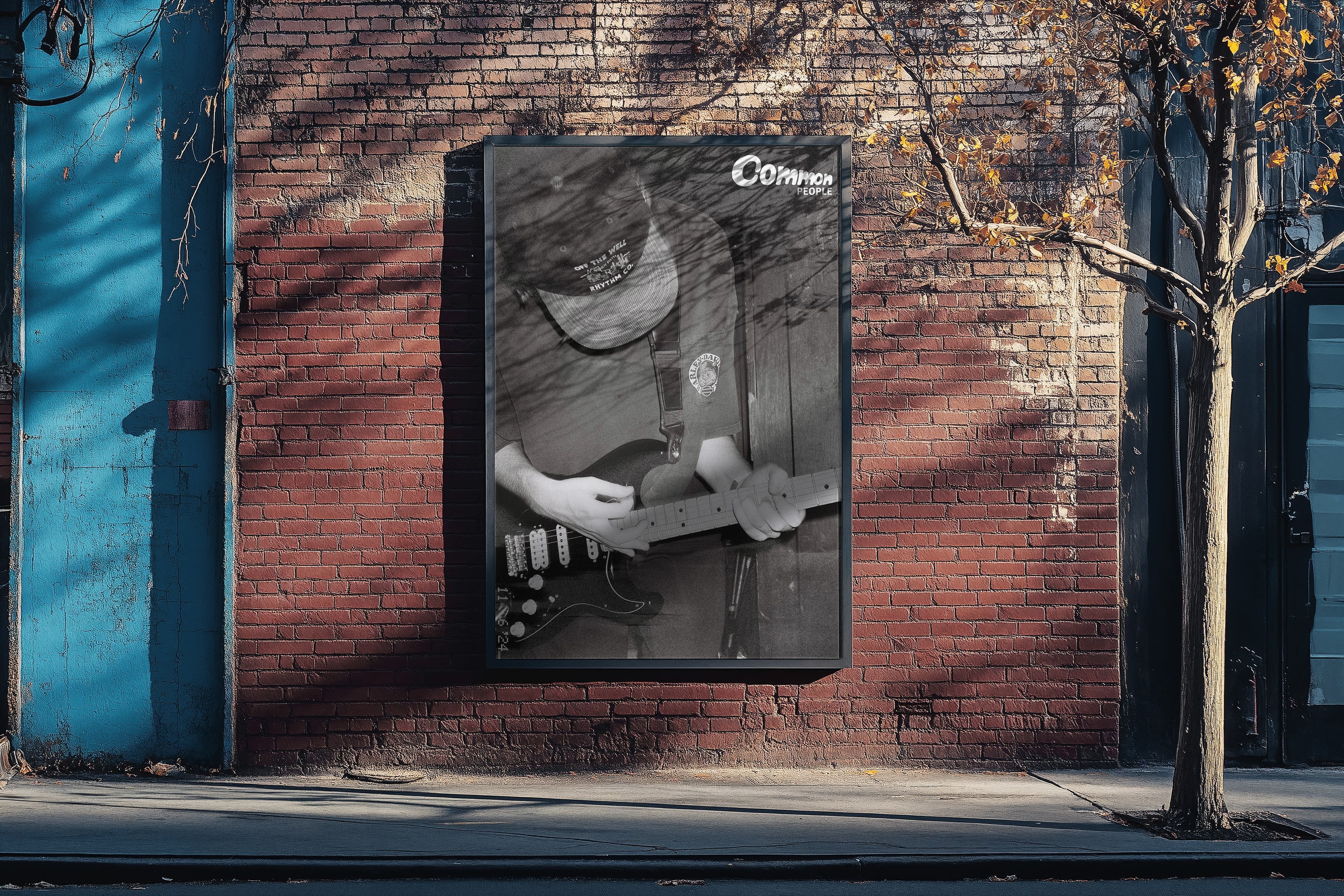
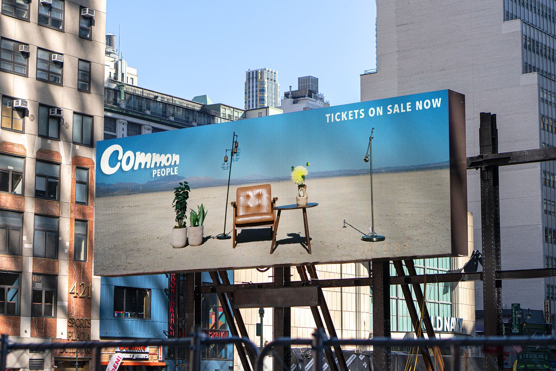
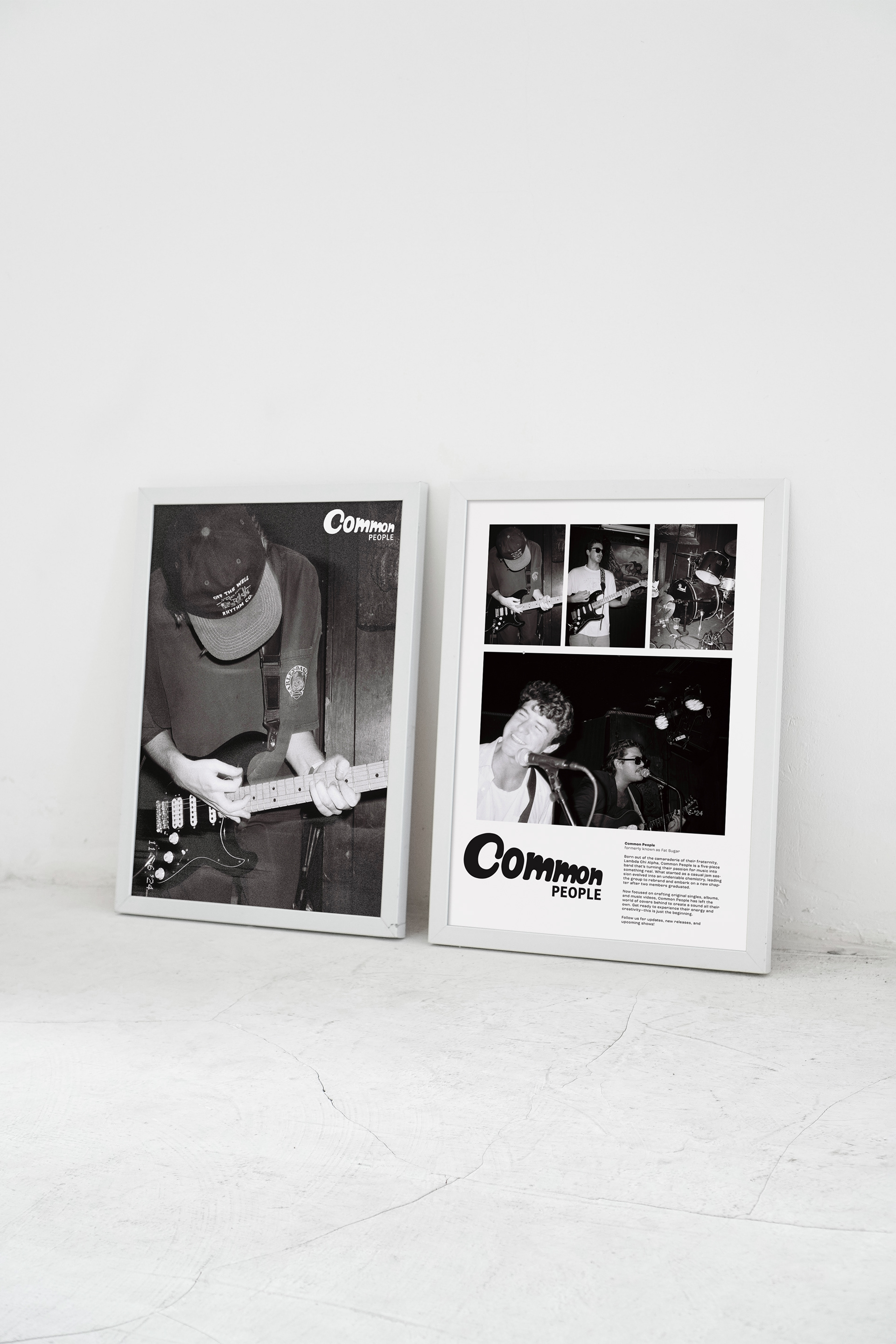
Common People is an indie band I joined as Head of Design, responsible for the full visual identity across every touchpoint, from logo and merchandise to social media graphics and printed flyers.
The creative challenge was translating sound into something you can see. I shifted the band’s visual direction toward a more modern, indie sensibility, building a cohesive aesthetic that could flex across a gig poster, a t-shirt, and an Instagram grid without losing its vibe.